AuraBloom
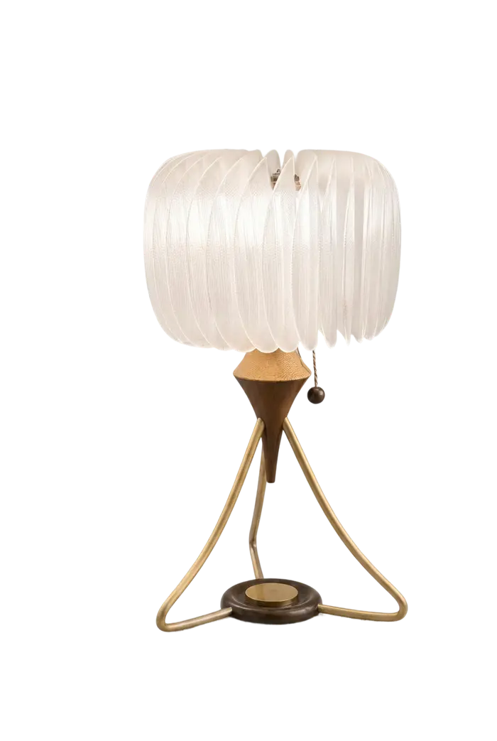
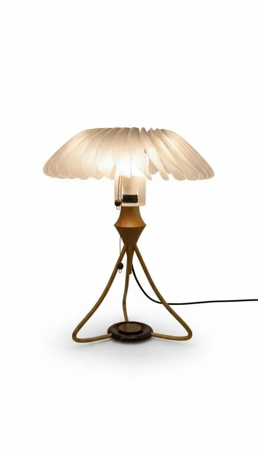
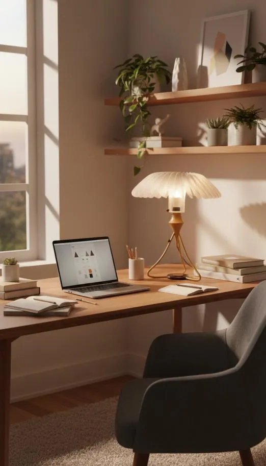
A desk lamp that helps students study with less stress. Dock your phone in its base and the petal shade slowly closes into focus, then blooms open as each session is completed. Calm is built into the furniture, not added as another app.
- Brief
- A user-centred stress-reduction device for students
- Role
- Individual project, research to prototype, about 2 months
- Methods
- AEIOU, interviews, persona, SIT, decision matrix, lo-fi to hi-fi
- Outcome
- Working prototype, shown at the course showcase
Stress students can't see, in a room they can't leave
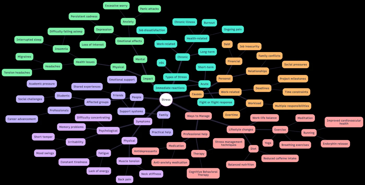
Students rarely describe their stress directly. They describe symptoms: checking their phone every few minutes, putting off hard work, losing an evening to scrolling. Behind each symptom is the same loop. A notification breaks focus, the phone becomes an escape, and guilt about the lost time makes the next escape more likely.
Most tools aimed at this problem are apps: blockers, timers and trackers. They work for a few days, then they become one more thing to manage and are abandoned. AuraBloom takes the opposite route. It is a beautiful object that already belongs on a desk, and the healthy behaviour, putting the phone down, is the only thing it asks for.
The project followed a Double Diamond process: Discover through observation, interviews and data; Define through a reframed design question and four principles; Develop through broad ideation, lo-fi models and material tests; and Deliver through detailed CAD, rendered CMF and a working, hand-finished prototype.
The question stopped being "how do we fit a stress tool into a student's day?" and became "how do we make the calm choice the easy one?"
Watching how students actually study
Research started with four 30-minute observation sessions of students aged 19 to 25, studying at their own desks: online lectures, reading and project work. Each session was logged with the AEIOU framework (Activities, Environment, Interactions, Objects, Users) so that behaviour, setting and triggers were recorded separately rather than as one impression.
| Activities | Environment | Interactions | Objects | Users |
|---|---|---|---|---|
| Checks phone every 3 to 5 minutes | Bedroom desk set-up | Anxiety-driven phone pickups | Smartphone, the main distraction | Aged 19 to 25, mixed genders |
| Procrastinates on difficult work | PC and phone always in arm's reach | Social media scrolling, 5 to 7 minutes on average | PC, a secondary source of distraction | Always online, driven by fear of missing out |
| A quick glance turns into scrolling | Constant notification sounds; work and leisure share one space | Notifications trigger use; a guilt cycle follows | Frustrated with their own behaviour |
Perceived versus actual screen time
Before seeing their phone's own figures, students estimated they spent two to three hours a day on screens. Their tracked screen time told a different story. Every participant had underestimated, one by more than four times.
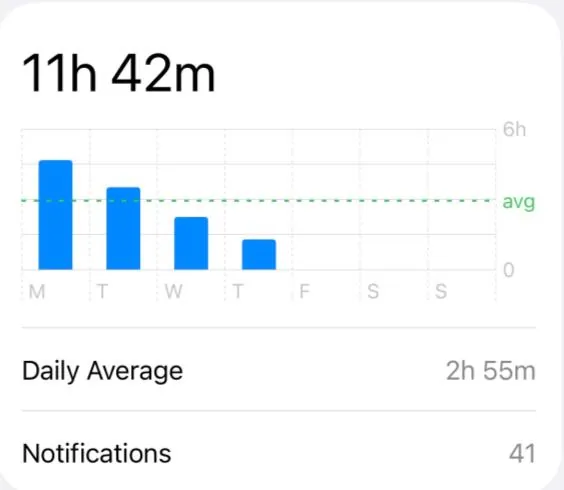
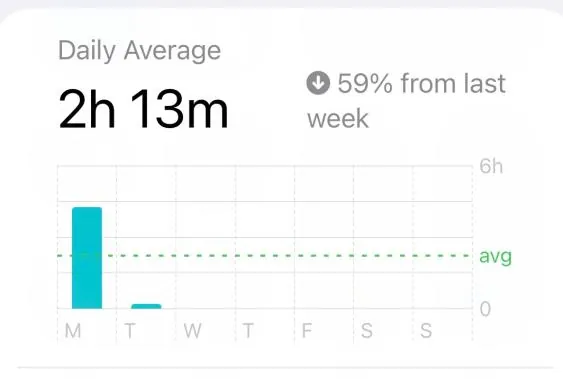
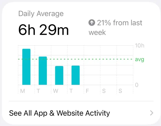
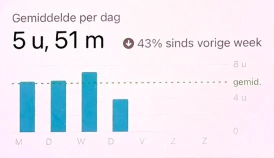
Participants' own Screen Time reports, shared with permission. The gap between perception and reality is itself a finding: students do not notice how fragmented their attention has become.
The wider picture
National data shows this is not a small-sample quirk. Among US teenagers aged 12 to 17, half report four or more hours of leisure screen time a day, and that group is more than twice as likely to report anxiety and depression symptoms [1]. Other studies link heavy use with lower wellbeing and poorer sleep [2–4].
What people say online
Communities such as r/digitalminimalism are full of people trying to cut their screen time [6]. Three themes kept coming up. Screen time itself is not the enemy; the habit of drifting from one notification into social media is. App blockers create friction that works for a few days before people relapse, because they do not fit into real life. And anything too strict, mentally or physically, gets switched off.
A good solution has to leave people free. If it feels like a restriction, it will be removed.
Interviews
Two second-year university students were interviewed in depth about how they study, plan and cope.
Interview 1 · 21 · London
Studies two to three hours each afternoon at a shared kitchen table with no dedicated space, around paid work and commuting. Relies on notifications for work, and on Apple Calendar plus a to-do app. Bullet journals and productivity apps failed because keeping them perfect became its own source of stress.
Insight: would value a flexible, forgiving tool that adapts to a busy life.
Interview 2 · 19 · Surrey
Studies three to five hours late at night at a bedroom desk that is also the gaming desk, in a noisy shared house. Multitasks across laptop, phone and tablet. Tried Notion Calendar but dropped it because it felt disconnected from everything else, and tends to start assignments close to the deadline.
Insight: would respond to a low-friction tool that fits seamlessly into existing life and devices.
Designing for the need, not the symptom
Cognitive overload makes it hard for students to diagnose their own problem, so what they say is usually a symptom. Mapping each statement to what it actually means, and then to what is actually needed, turned four complaints into four design opportunities.
| What students say | What they mean | What they need |
|---|---|---|
| "I check my phone every 3 to 5 minutes" | "I feel anxious when I don't check my phone" | Something that interrupts the anxiety and notification cycle |
| "I procrastinate on difficult work" | "I use my phone as an escape when I'm overwhelmed" | An environment that makes avoidance harder |
| "My bedroom is distracting" | "I have no control; my phone and PC are always in reach" | Physical and digital boundaries between devices |
| "Constant notifications stop me focusing" | "Alerts trigger reflexive checking" | A system that manages notifications for me |
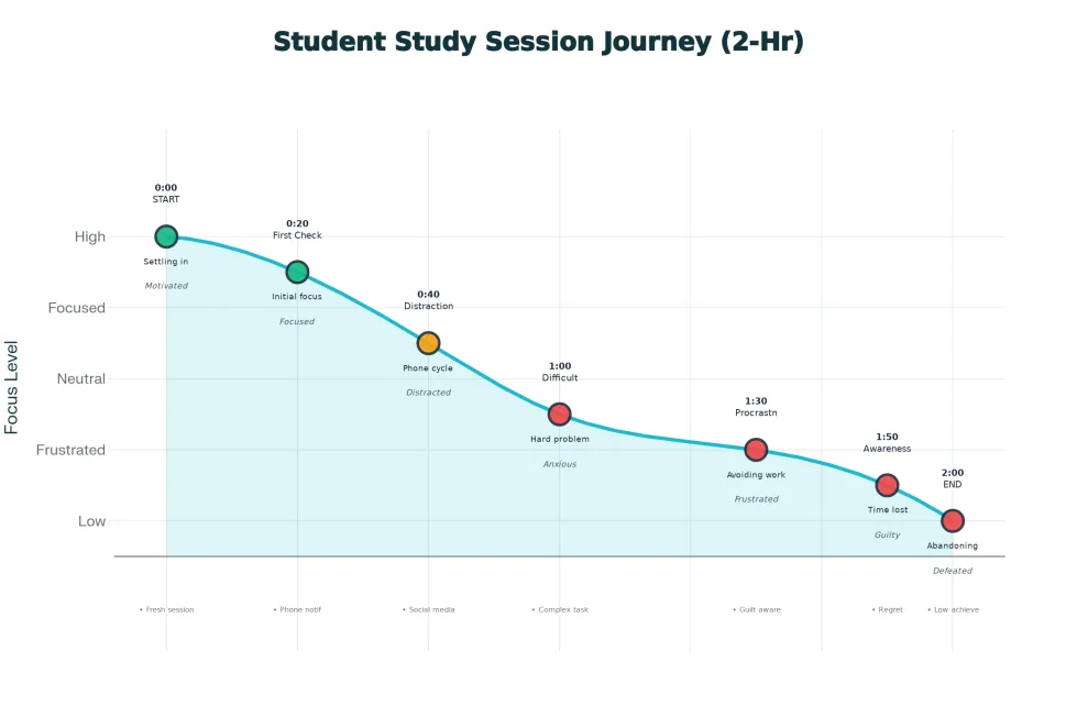
The journey of a study session
Plotting focus across a typical two-hour session showed where it goes wrong. Students start fresh and focused. The first notification check begins a slow decline; social media turns the decline into a drop; and the moment they realise they have stopped working, guilt sets in and keeps them in the loop.
Explicit pain points
- Notifications break flow state
- Difficult tasks trigger an escape to the phone
- Time blindness: five minutes becomes thirty
- Guilt cycles reduce motivation
- A blurred work and leisure space enables distraction
Latent pain points
- No visible progress or feedback
- No friction against picking the phone up
- Decision fatigue
- No support during difficult tasks
Persona: the overwhelmed achiever
- Name
- Alex, 20
- Study
- Second-year engineering student
- Goals
- Keep grades high, balance commitments without burning out, build study habits that last
- Today
- Studies in four to six hour library blocks. Downloads focus apps, then abandons them. Copes with coffee and headphones.
- Frustrations
- Doesn't notice stress until already depleted. Wellness tools add to the mental load instead of reducing it.
Point of view
Alex needs environmental support that responds to stress before awareness disappears, because by the time overload is recognised, the capacity to engage with a solution is already gone.
Asking a better question
The research produced three starting questions, each covering a different side of the problem.
How might we give young adults information about their stress to help them reduce it?
How might we help students address stress without conscious effort or extra mental load?
How might we design stress relief that fits into students' routines and disrupts stress-causing habits?
The third question was the strongest, but it still treated the product as something to slot into a routine. Reframing it moved the focus from the object to the outcome: actively shaping the routine so that the helpful choice feels easy and rewarding.
Initial question
How might we design stress relief solutions that integrate seamlessly into students' daily routines but also help disrupt stress-causing habits?
Reframed question
How might we make stress management feel effortless and rewarding, so that students consciously choose helpful routines over stress-inducing behaviour?
This matched what users had said, that generic stress tools are abandoned the moment they feel like effort, and the brief's emphasis on lasting behaviour rather than a one-off gadget.
Four design principles
Before choosing any solution, the qualities every concept had to have were fixed. They became the scoring criteria for everything that followed.
Effortless to adopt
Fits into the student's existing space and tools, with almost no set-up, learning curve or decisions.
Routine adaptive
Flexes around changing timetables, deadlines, energy and jobs, nudging towards a healthier pattern instead of demanding a fixed schedule.
Emotionally rewarding
Interactions feel positive, so managing stress is linked to small moments of satisfaction rather than guilt or failure.
Sustained engagement
Gentle feedback and progression keep the experience interesting over weeks, so students keep using it.
Many ideas, scored honestly
Ideation used Systematic Inventive Thinking (SIT): four tools, each applied against each design principle, to force ideas out of the obvious. Sixteen cells, sixteen directions.
| SIT tool | Effortless to adopt | Routine adaptive | Emotionally rewarding | Sustained engagement |
|---|---|---|---|---|
| Subtraction | No app sign-up: one capacitive touch starts a calm session | No fixed schedule: it only nudges after long, unbroken study | No progress bars: a single mood orb softens after each break | Only two repeatable actions, so it still works when tired |
| Division | A base plus a clip-on token; the base works alone as a passive desk object | Separate day and evening modes for focus and wind-down | Tiny moments of delight: a haptic pulse and soft light after each breathing cycle | Weekly themes (focus, sleep, social) renew interest |
| Multiplication | The same quick break from the device, a keyboard shortcut or a phone widget | Different reminder rules for long sitting, deadlines and late nights | Every calm action earns an instant sensory reward and a streak bead | One object as fidget, desk light cue and wind-down aid |
| Attribute dependency | More responsive when laptop and phone are both active | Nudges scale with timetable load: more in assessment weeks | Colour and tone follow the user's stress trend | New patterns and textures unlock as calm minutes add up |
Borrowing from other worlds
Alternate Worlds asked how three very different companies would approach the same problem.
Invisible, self-reinforcing habits
Calm feedback and very low friction make new behaviour feel native. Stress relief could live in existing objects and gestures, not a new app.Micro-rewards and progress
Small actions become wins. However small the student's step, it can be celebrated, so it feels like building a skill rather than fixing a flaw.Routines as modular furniture
People arrange their own spaces. Stress-reducing routines could be pieces students arrange around their room, giving them ownership.Sketching wide, then narrowing
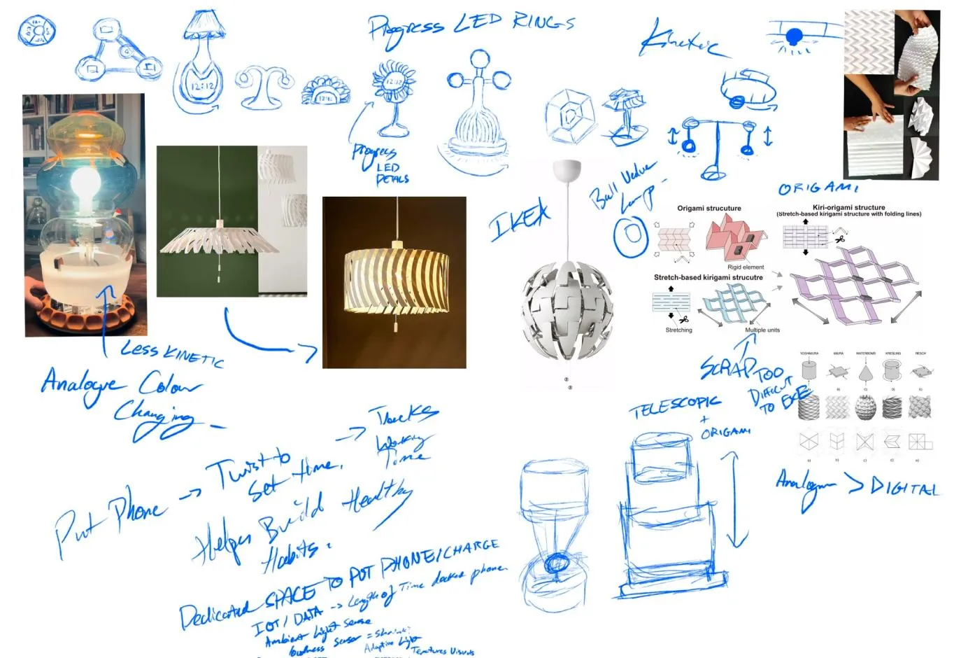
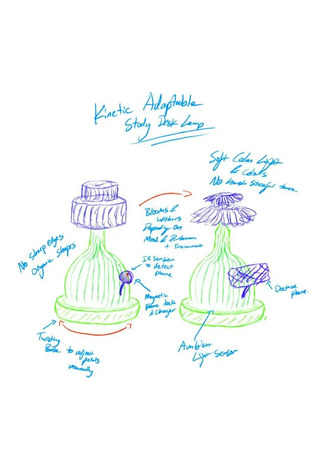
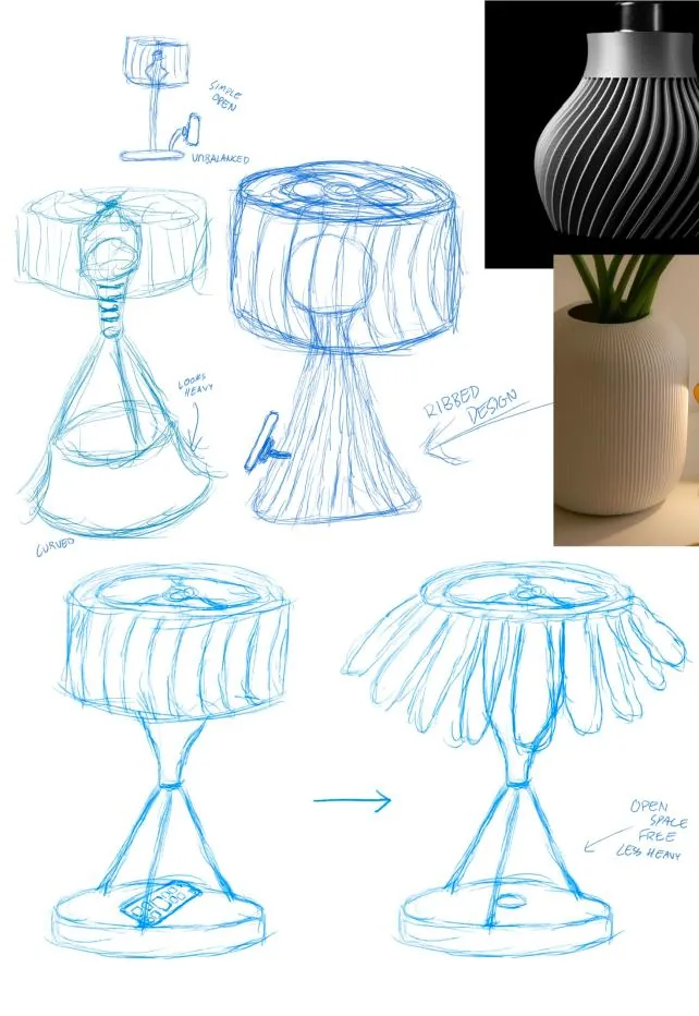
Early sketches explored desk buddies, wall-hung pieces and fidget devices before settling on a lamp: an object every student already has, with plenty of room to experiment in light, form and interaction. Walking around London with an eye out for inspiration added fabric and analogue lamps to the references, and a visit to IKEA added adjustable ones.
Decision matrix
Sixteen lamp concepts were plotted by impact against difficulty, a simple way to compare many ideas on the same criteria and move to one clear direction. The adaptive form lamp, a shade whose shape changes in response to a sensor, gave the highest impact for the lowest risk, and was taken forward.
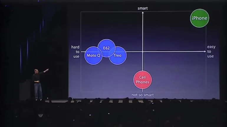
The method has a famous precedent. When Steve Jobs introduced the iPhone, he placed the existing smartphones on a simple two-axis chart, smart against easy to use, to show the gap his product would fill.
A lamp that changes its interface
At the 2007 iPhone launch, Steve Jobs criticised phones whose fixed plastic keyboards were "the same for every application", even though "every application wants a slightly different user interface" [5]. The user had to adapt to the hardware.
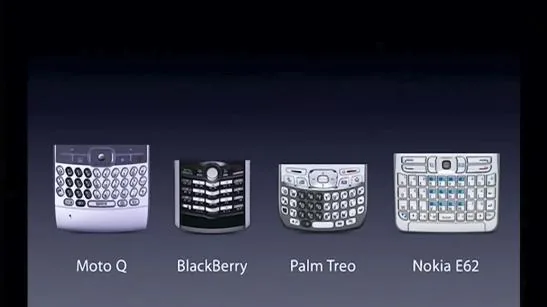
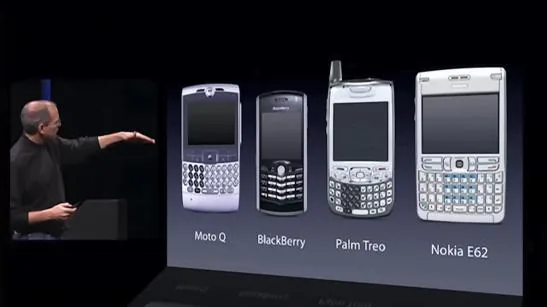
The fixed plastic keyboards Jobs criticised, "the same for every application". Images: Apple, iPhone introduction keynote, Macworld San Francisco, January 2007 [5].
A static lampshade is that fixed keyboard. It offers one mood to every student, on every day, though stress looks different for everyone. AuraBloom treats the lamp as a flexible interface instead: like a touchscreen reshaping itself around each app, its light and form reshape around each student, from deadline weeks to easy days.
Docking the phone is the interaction
The concept connects the lamp to the real cause found in research. The base holds the student's phone on a Qi2 MagSafe charger. Putting the phone down is the one action asked for, and it is rewarded: the lamp reads how long the phone has been docked, settles into focus, and lets the shade bloom open as study sessions are completed. Picking the phone up is never blocked, only made slightly less automatic.
From cardboard to a blooming form
Lo-fi model
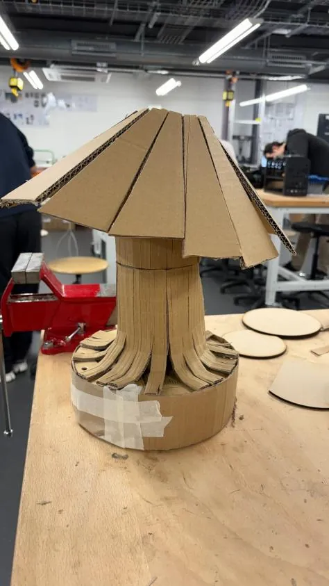
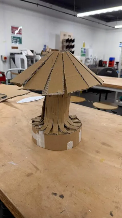
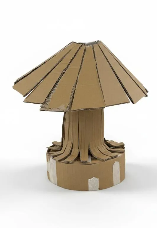
A quick cardboard model checked size and proportion on a real desk. The critique was clear: the base felt too heavy, visually and physically, and the thick stem added nothing. Both points shaped the next round.
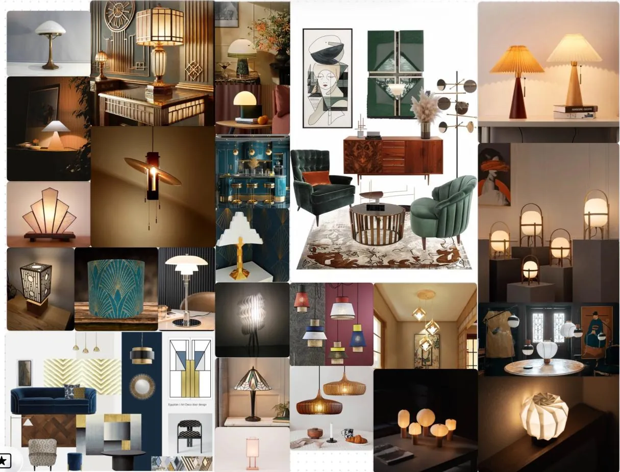
Moodboard: Art Deco meets Japandi
The style direction pairs two traditions. From Art Deco lighting: brushed and polished brass, strong geometry, fluted and ribbed glass, and rich, warm light through frosted shades. From Japandi: calm neutral bases, natural wood and paper, minimal lantern-like forms, and an interest in the play of light and shadow rather than ornament. The result should feel luxurious yet tranquil.
Form development
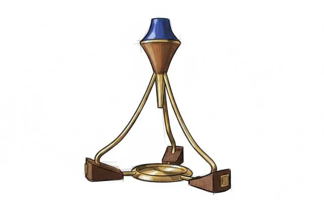
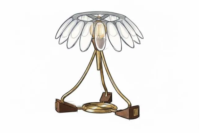
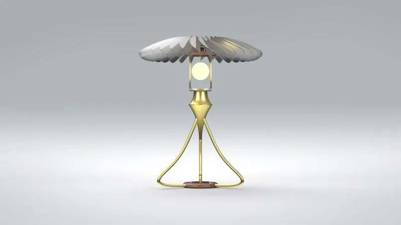
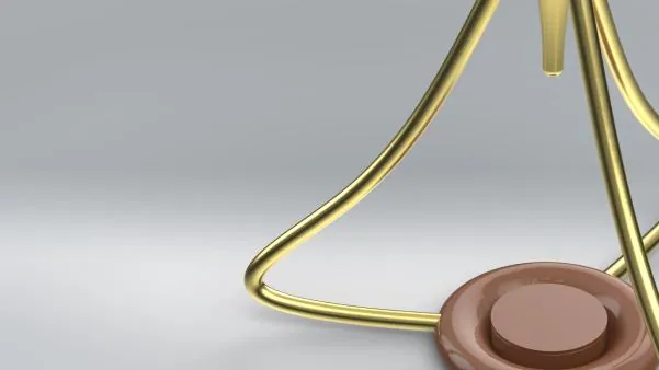
The shade took its cue from biomimicry: a flower that opens and closes. Its petals change the mood of the lamp and the spread of its light, closed and diffuse for focus, open and direct for a break. Earlier sketches had a tripod that simply sat on the base, and feedback said the two felt disconnected. The legs were redesigned to curve back into the base, so stand and dock read as one piece.
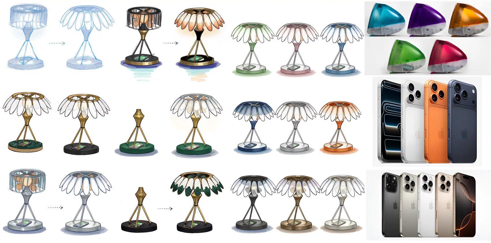
Colour, material, finish
Warm brass was chosen over chrome or black because it echoes premium home objects and casts a softer visual tone, so the lamp reads as calming décor rather than one more piece of technical equipment on a crowded desk. Translucent petals and natural tones carry the Japandi side: statement lighting that is sculptural and Deco, softened into something quiet.
Signifiers and affordances
A stressed student will not read instructions, so the form itself has to explain where the phone goes.
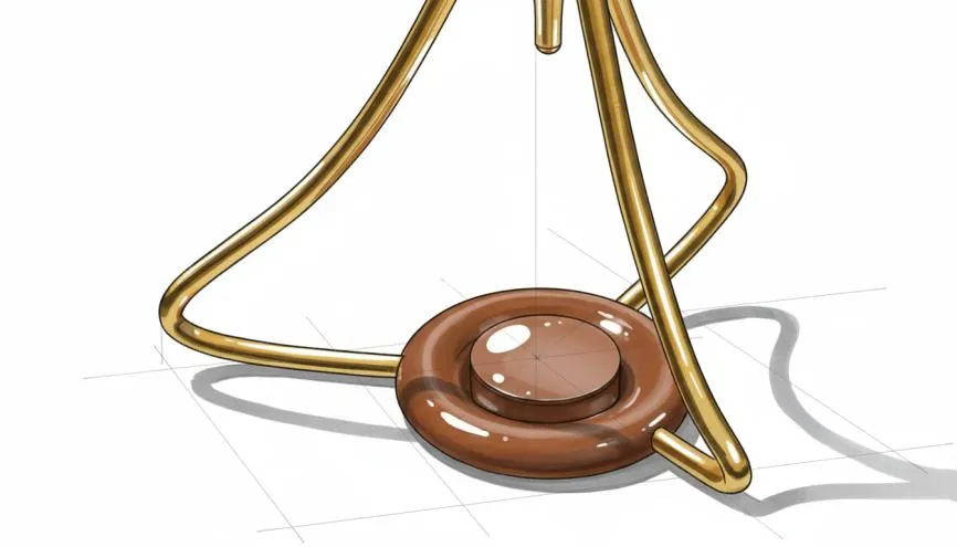
How the form guides the hand
- Plinth. Raised, flat, central and sized for a phone, it physically affords placing one there. A lower ring separates it from the rest of the base, so it reads as a distinct landing zone.
- Legs. The three legs sweep down and converge on the plinth like arrows, directing the eye to it.
- Alignment. The connector under the bulb holder points down at the same spot, reinforcing that the phone is the focus of the product.
Anthropometry and ergonomics
AuraBloom is sized for seated students aged 18 to 25 at a typical UK desk (120 cm wide).
Testing every petal
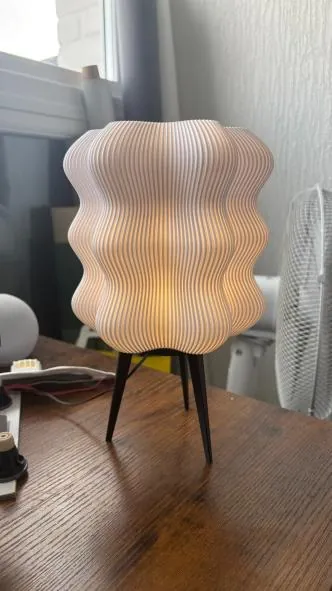
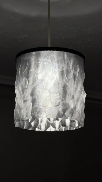
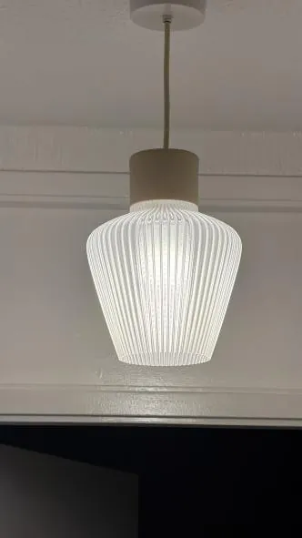
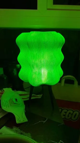
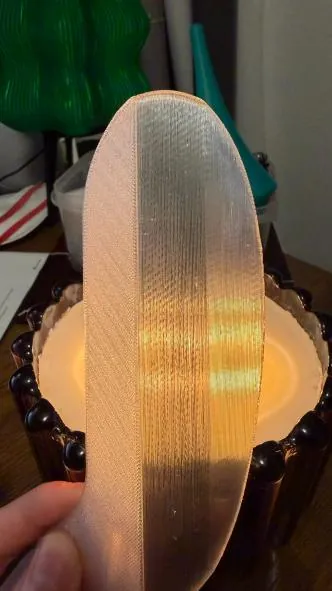
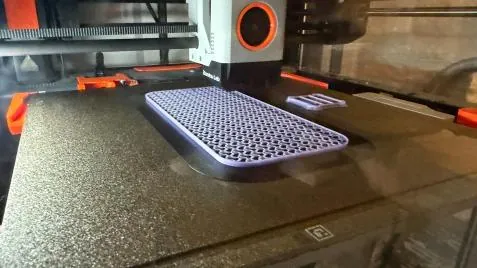
Petal shades were printed in standard PLA, PETG and translucent PETG. The tests also showed how different shade forms feel in a real room, and confirmed that a morphing shade was the right call: one fixed shape could not cover both focus and rest. Translucent PETG won, with the right amount of light through the petals and higher temperature resistance for safety next to a bulb.
| Property | PLA | PETG | Clear resin | Opaque resin |
|---|---|---|---|---|
| Transparency | Opaque | Semi-transparent | Very high | Opaque |
| Bonding | Good, PLA to PLA | Poor with PLA | Not applicable | Good |
| Detail | Moderate | Moderate | Very high | Very high |
| Durability | Good for the light holder | Good for the shade | Brittle | Brittle |
| Post-processing | Minimal | Minimal | Extensive | Extensive |
| Best use | Light holder | Lampshade | Not practical | Organic shapes |
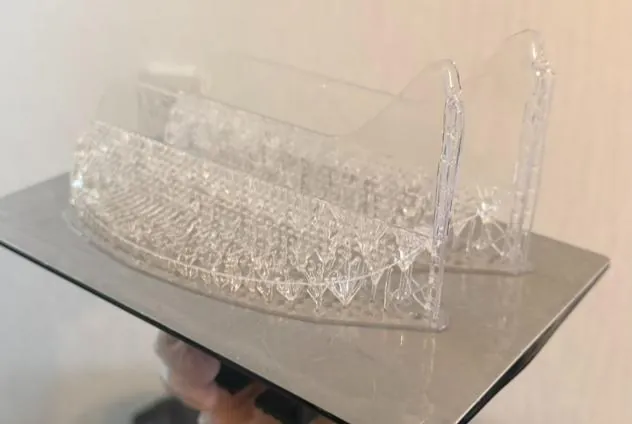
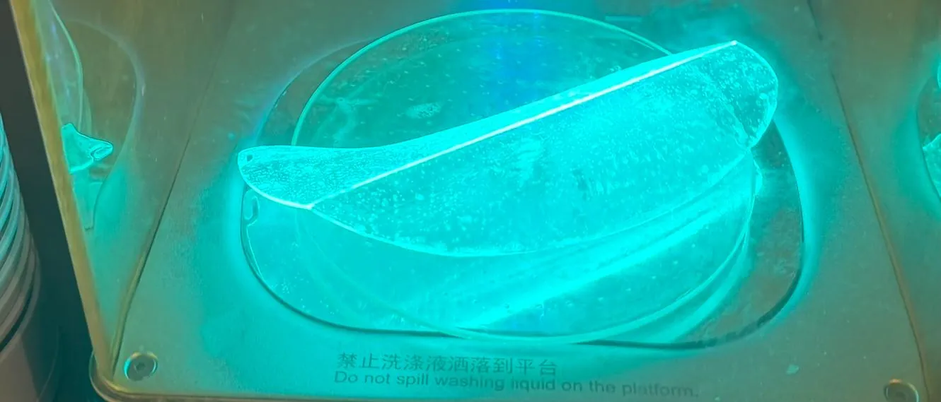
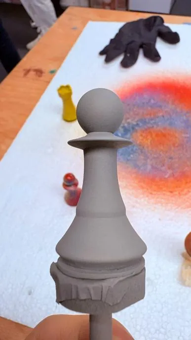
Hand-finishing workshop
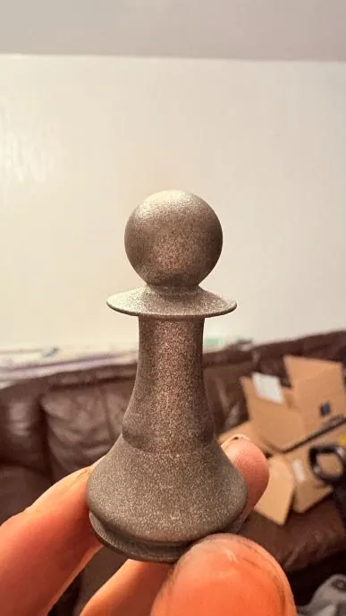
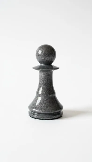
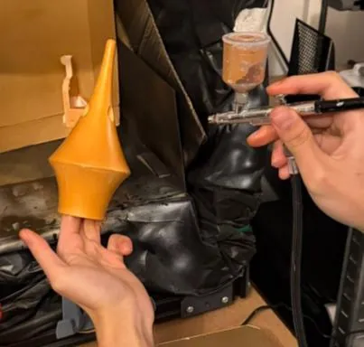
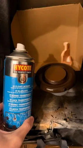
To get a convincing aged-metal finish from a resin print, a finishing process was developed on test pieces first: progressive sanding and priming to fill divots, a splattered silver spray coat, repeated rubs of graphite powder, a very light sand at high grit, then clear coat. It is a technique ILM used throughout the Star Wars models to make plastic read as worn metal.
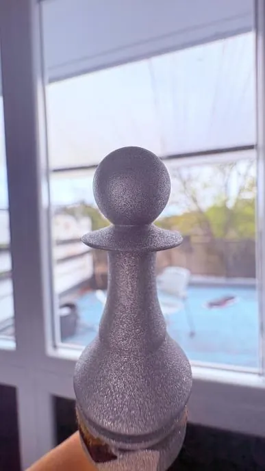
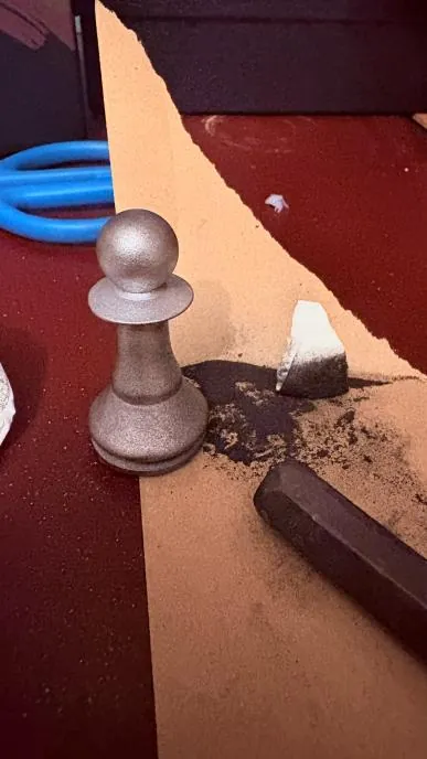
Detailed in CAD, staged in Visualize
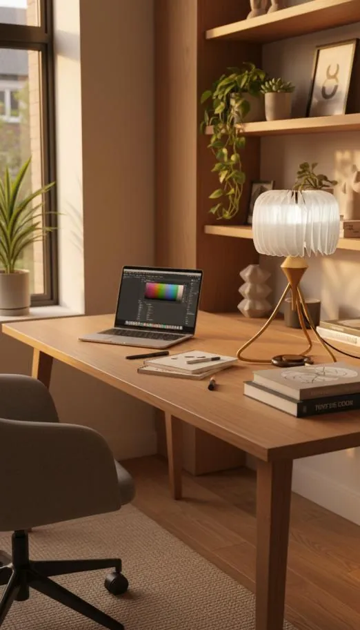
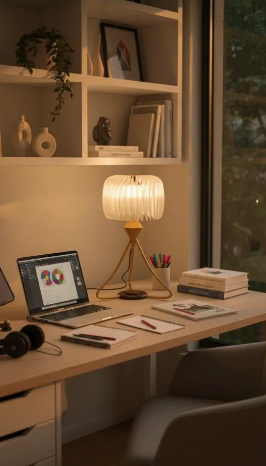
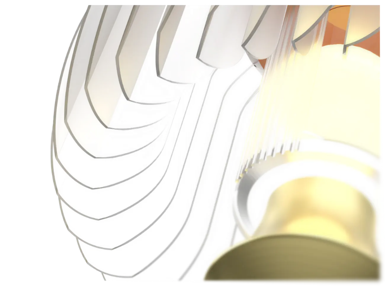
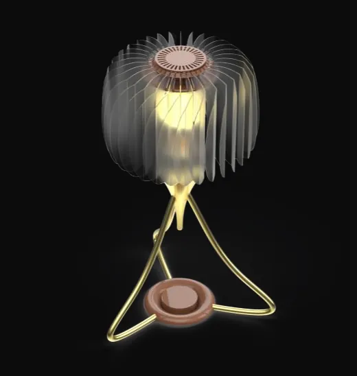
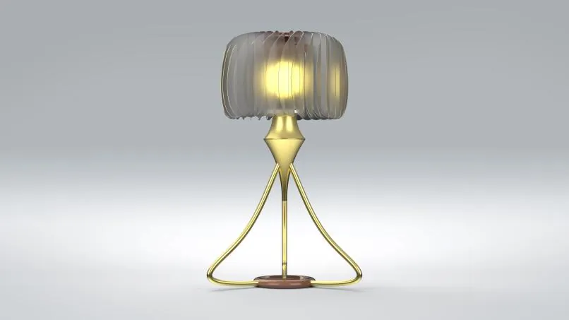
The final design was modelled in full, from the swept brass legs and the stepped base to each petal of the shade, then rendered in SolidWorks Visualize. The renders were used as design tools as much as presentation: to judge the brass against walnut, the glow through the petals, and how the lamp sits in a real study space.
Built, finished and working
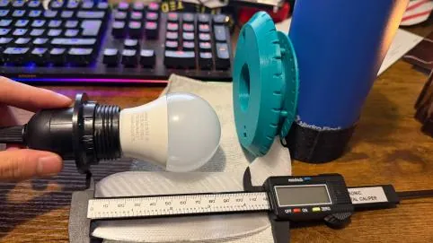
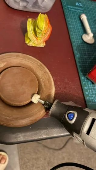
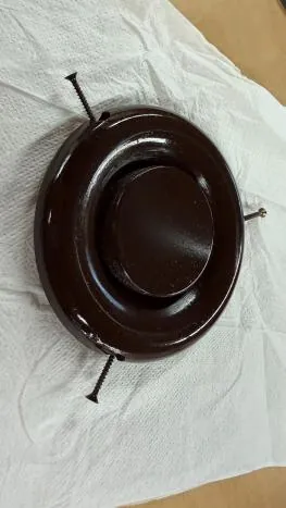
The prototype brings everything together: printed petals and light holder, a turned and hand-finished base, formed brass-effect legs and the electronics for the light. Parts were test-fitted and measured throughout, and the finishing process from the workshop carried across to the final pieces.
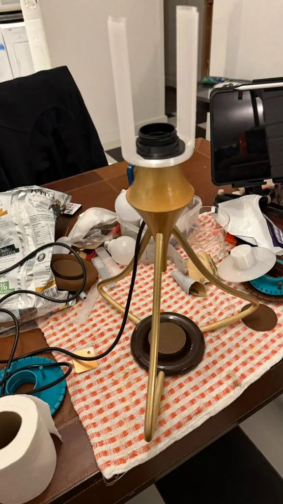
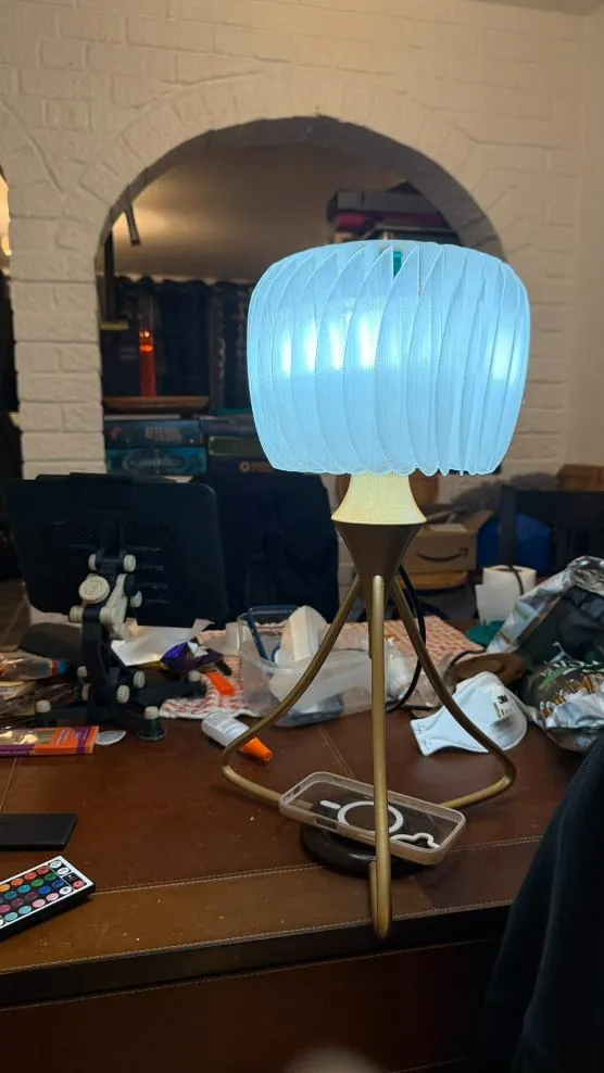
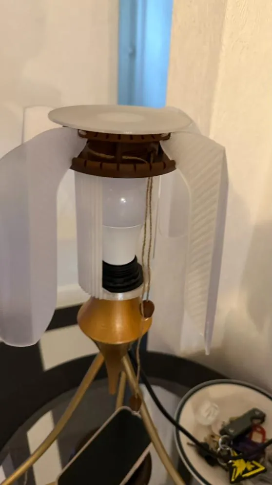
Showcase
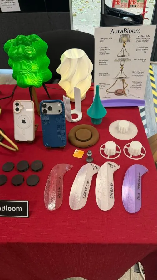
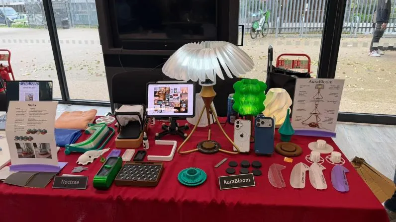
AuraBloom was shown at the course showcase alongside its test prints, finishing samples and annotated board, so visitors could follow the process from the first material test to the working lamp.
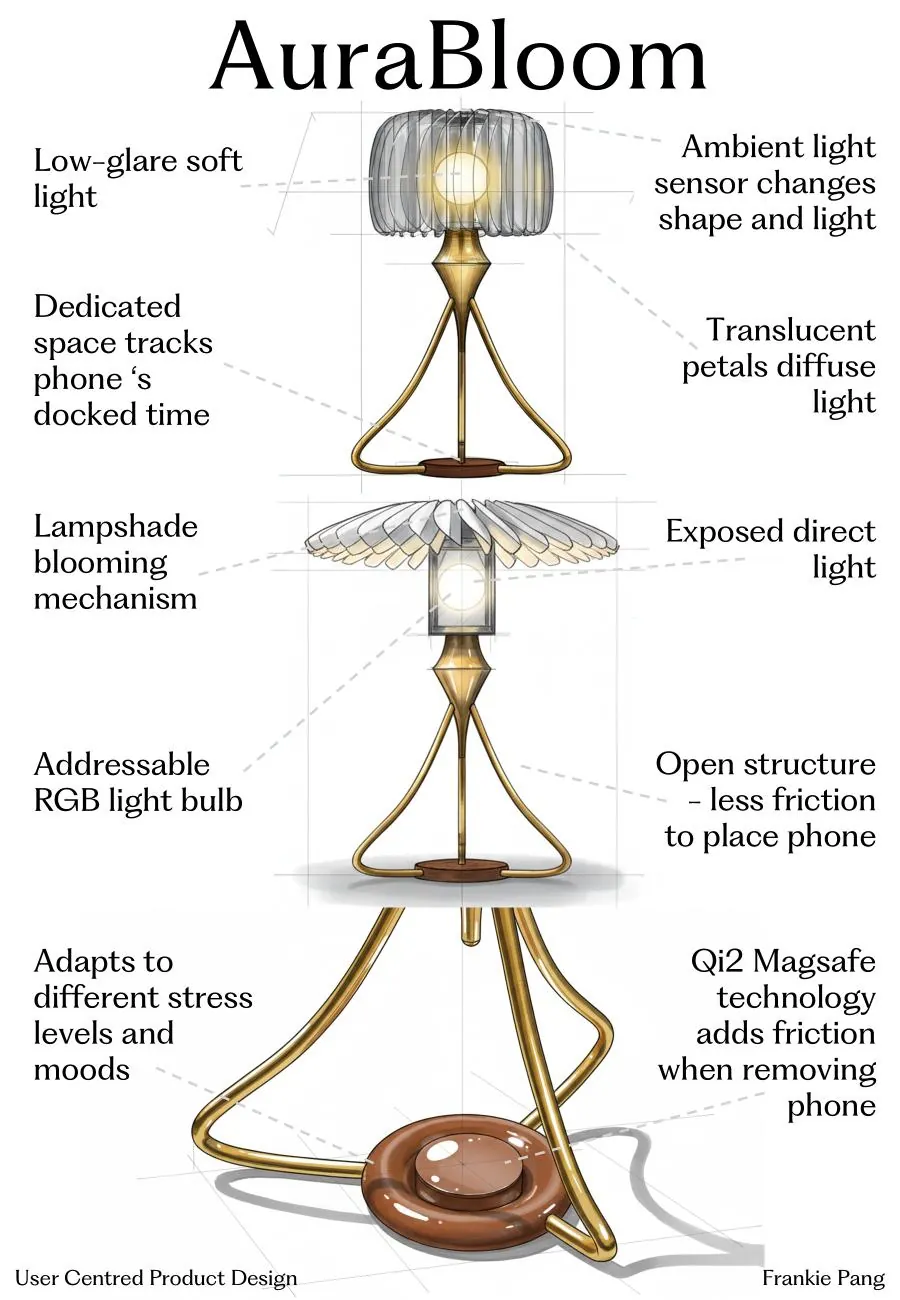
How AuraBloom works
Every feature traces back to one of the four principles set in the Define stage.
Effortless to adopt
The phone docks straight onto the base via Qi2 MagSafe, with no app or set-up. The lamp reads how long it has been docked and enters focus mode on its own, so stress management becomes a by-product of normal behaviour.
Routine adaptive
The shade opens and closes with dock time and stress patterns, closed during focus and opening for breaks, so the day's rhythm becomes visible. An ambient light sensor shifts the light colour through the day without input.
Emotionally rewarding
Each completed focus block unfolds the petals a little further and warms the light. The streak-bead idea from ideation survives, as a sculptural transformation rather than gamified numbers.
Sustained engagement
Exposed direct light and translucent petals mean the lamp never looks the same twice. As light changes and petals move it stays visually interesting, encouraging use over weeks rather than days.
Why this form
- Clear affordance. The raised plinth and contrasting ring make an unmistakable landing zone, removing any doubt about how to use it.
- Legs as signifiers. Three curved legs converge on the plinth like arrows, guiding the eye and hand to the one action that starts the calming routine.
- Shade as feedback. The petals expand and contract with focus time and stress, turning an invisible state, mental load, into a gently animated form.
- Soft, organic aesthetic. Flowing brass and a rounded base contrast with the hard rectangle of the phone, signalling a calmer, slower mode than the screen.
- Open structure. The tripod leaves the plinth reachable from every angle, so a distracted student can drop the phone down without threading it through a frame.
Standards and intellectual property
Compliance
- BS EN 62471 photobiological safety: Risk Group 0, with colour temperature held between 2700 and 6500 K to avoid excess blue light in the evening.
- BS EN 61000-6-2 immunity, so it never interferes with laptops, phones or medical devices in shared spaces.
- BS EN 60950-1 and BS EN 61010-1 electrical safety, including base stability.
Protecting the idea
Existing patents cover HRV wearables, app-controlled circadian lamps and streak mechanics, but not a physically adaptive lamp driven by learned stress and routine patterns. The learning method could be protected as a process patent and the form as a registered design. It uses only standard components, so there are no licences to pay and nothing stops production scaling to 10,000 units.
What AuraBloom taught me
- Reframing the problem unlocks innovation. Moving from "how might we design…" to "how might we make stress management feel effortless and rewarding" changed the product completely, from a static tool to an adaptive one built around a human outcome.
- Form and function must speak together. The petals are not only beautiful; they are the feedback that makes invisible stress visible. Design for wellbeing needs aesthetics and behaviour that reinforce each other.
- Affordances drive adoption. When people are stressed they won't read a manual. The plinth, the converging legs and the open structure explain the product without words.
- Adaptability beats perfection. Stress varies by day, deadline and person. A one-size-fits-all calming product fails because it doesn't match real life.
- Research never really ends. Every round of feedback, from the cardboard model to the leg redesign, made the product better.
- Design for stress with empathy, not judgement. Many stress products feel clinical or shaming. AuraBloom's warmth, passive interaction and celebration of small wins come from a belief that calm is built through gentle encouragement, not rigid discipline.
Sources
- Zablotsky, B., Arockiaraj, B., Haile, G. and Ng, A.E. (2024) Daily screen time among teenagers: United States, July 2021–December 2023. NCHS Data Brief no. 513. National Center for Health Statistics. cdc.gov
- Twenge, J.M. and Campbell, W.K. (2018) 'Associations between screen time and lower psychological well-being among children and adolescents: evidence from a population-based study', Preventive Medicine Reports, 12, pp. 271–283.
- Hmidan, A., Seguin, D. and Duerden, E.G. (2023) 'Media screen time use and mental health in school aged children during the pandemic', BMC Psychology, 11(1), p. 202. doi.org
- Alshoaibi, Y., Bafil, W. and Rahim, M. (2023) 'The effect of screen use on sleep quality among adolescents in Riyadh, Saudi Arabia', Journal of Family Medicine and Primary Care, 12(7), pp. 1379–1388. doi.org
- Jobs, S. (2007) iPhone introduction keynote, Macworld San Francisco, January 2007. Apple Inc. Keynote stills used for commentary and research, © Apple Inc.
- r/digitalminimalism (2024) Community discussions on screen time reduction, productivity apps and behaviour change. reddit.com